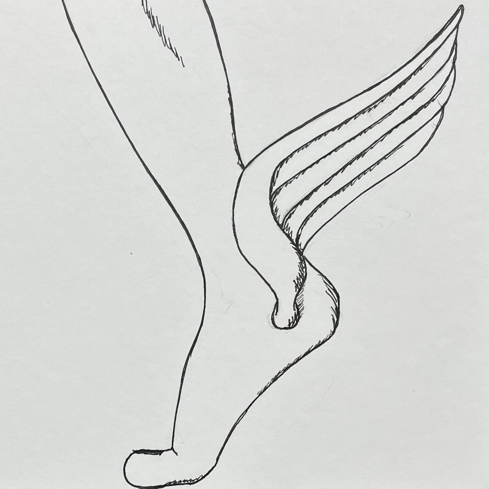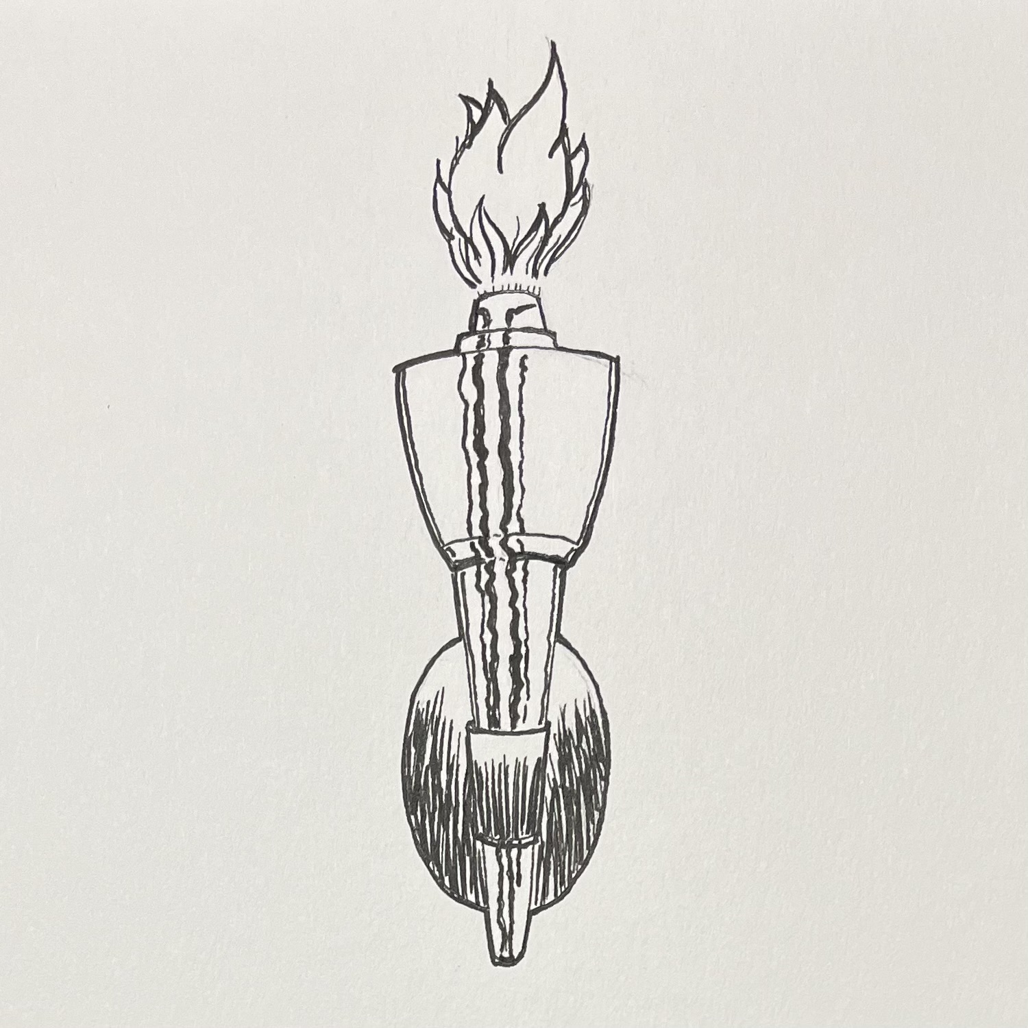
Today’s prompt, the last one for 2023, was “fire”.
Whew! Did it!
Tried to get a little Kirby in the reflection on the metal, but man. That guy was the king.
Today’s prompt, the last one for 2023, was “fire”.
Whew! Did it!
Tried to get a little Kirby in the reflection on the metal, but man. That guy was the king.
The daily prompt was “rush”.
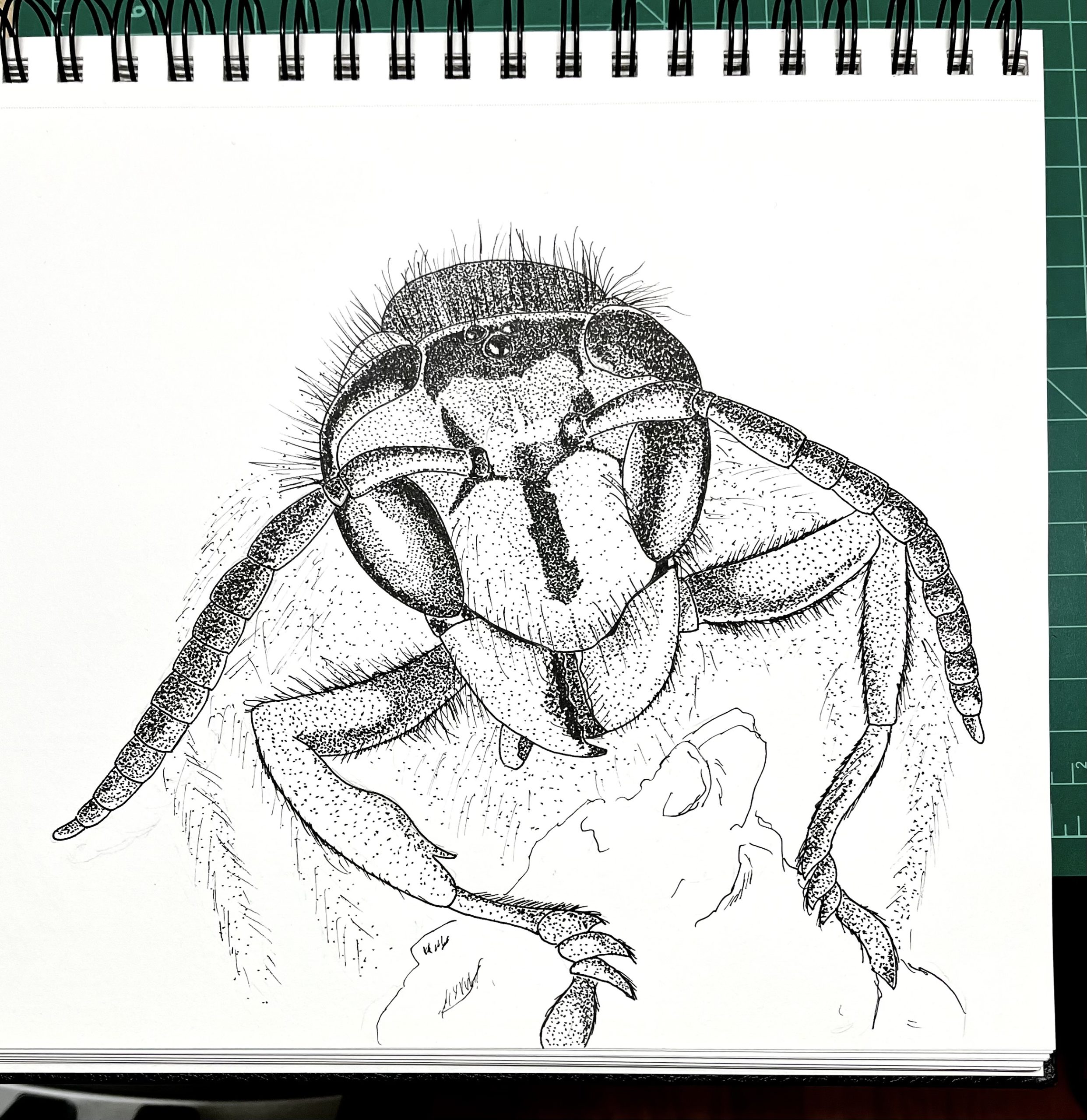
Today’s prompt was “massive”.
Whew! Look at the size of that wasp!!
Also, note to self: Don’t pick photos with huge swaths of blurry wasp parts. Still pretty happy with it though.
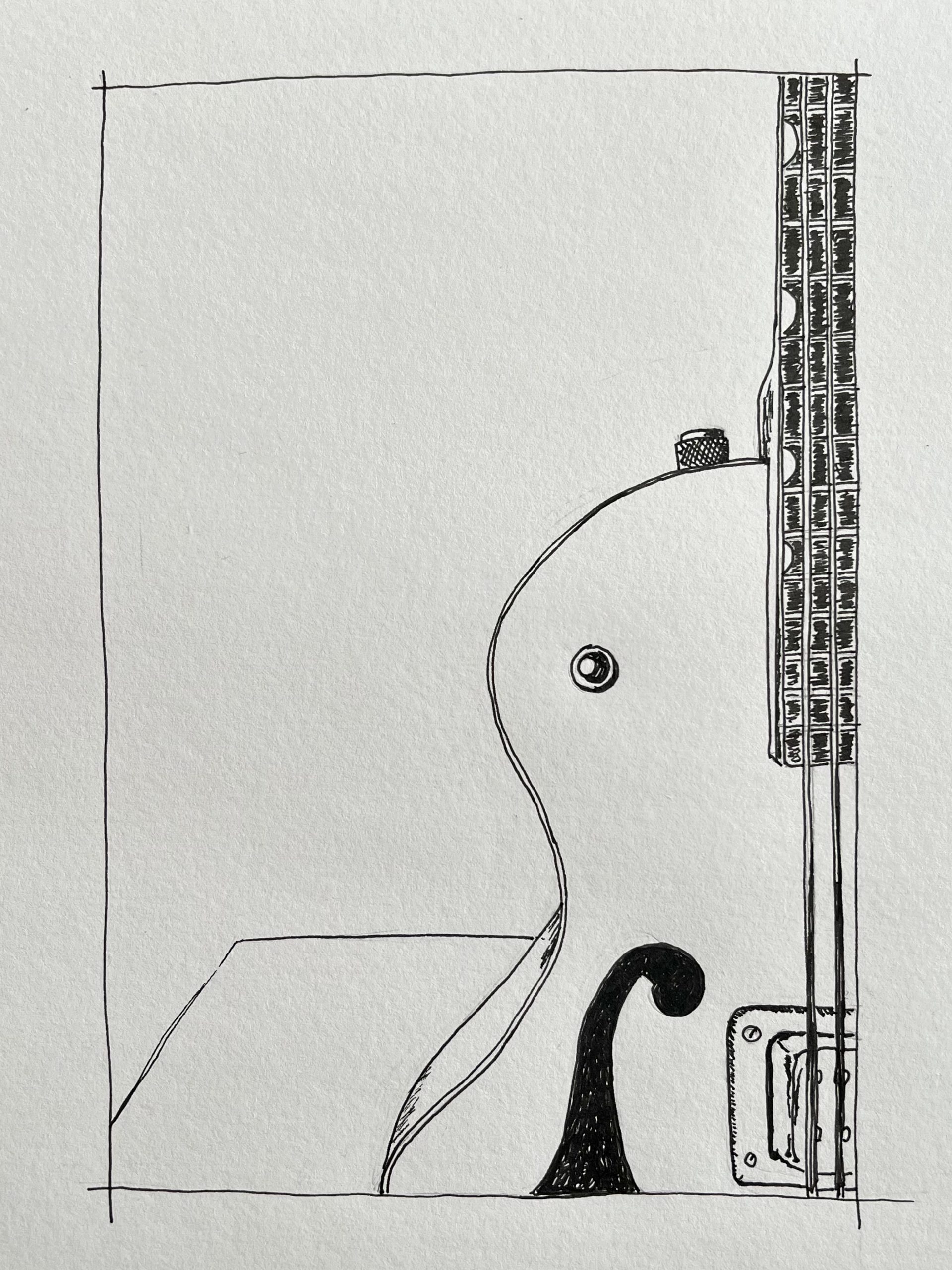
Today’s prompt was “sparkle”.
Guitars are fussy things to draw. Compound curves all over the place, big areas with subtle bends and so many fine, long, straight lines.
I own two Gretsch hollow-bodies and one of them is literally sparkly. Its finish is this amazing silver-blue icy glitter. I got stumped trying to represent that with black and white ink, so I’ll come back to it later.
For now, this the other one. Let’s say it metaphorically sparkles.
I do like the way the not quite completely blacked-in F-hole provides a little depth.
(Guitar nerds, it’s 1959 6119 Tennessean with a single bridge pickup.)
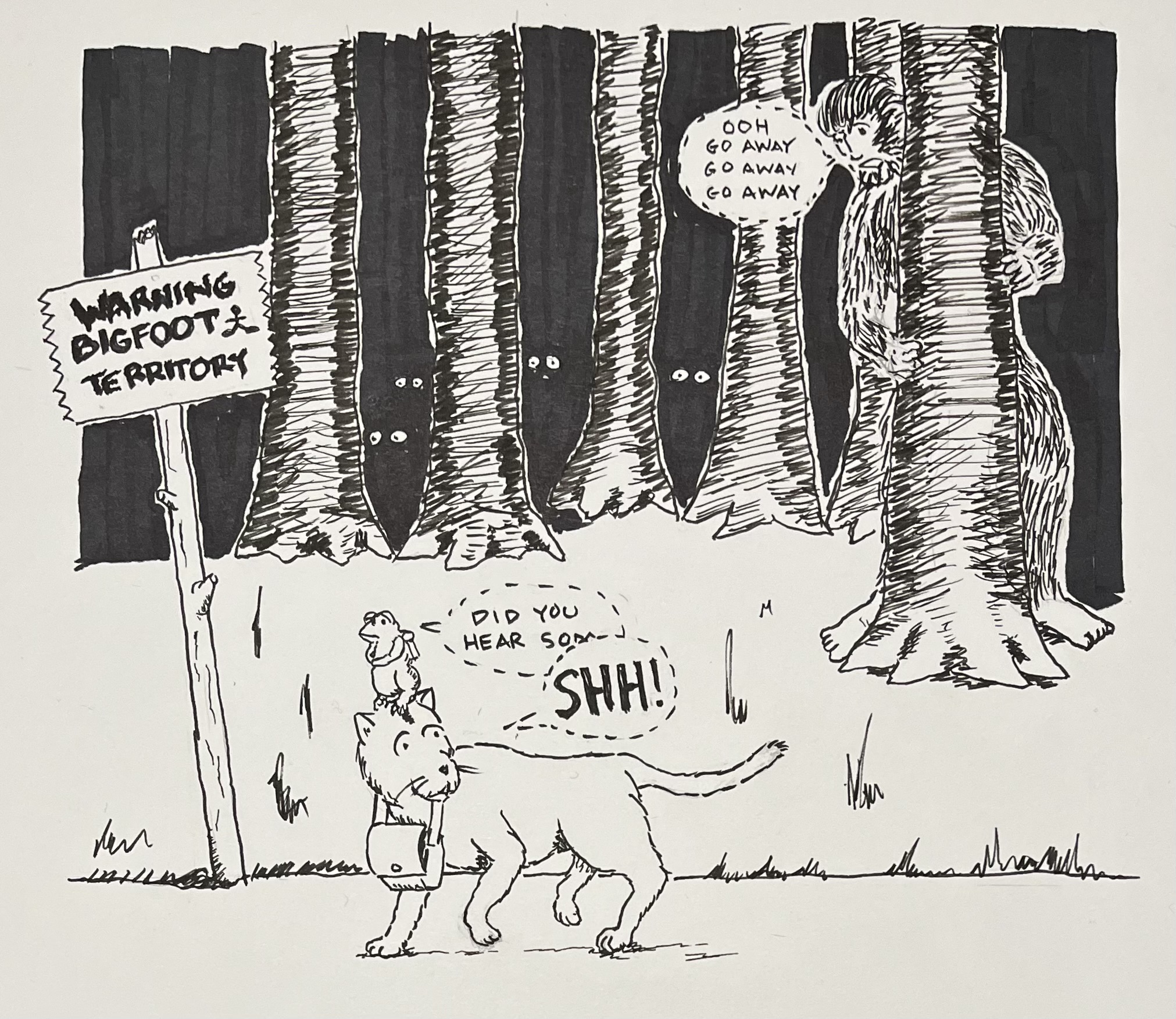
Today’s prompt was “beast”.
Whomst is the beast anyway?!?
I have never been a fan of “handwriting” typefaces for computers. For the most part, the quirks that make handwriting interesting don’t translate to a rigid set of letters and numbers. A person scribbling notes is not going to make every letter exactly the same every time, and block of text quickly slips into a typographical uncanny valley when you realize the same weird descender on the lower-case g is identical in every single word.
Even professional letterers are not 100% consistent, although they are consistent enough that one of the historically largest industries for hand lettering — comic books — has largely shifted to type-setting the speech bubbles that used to be so painstakingly written by human hands, and the computer stuff is admittedly often indistinguishable from the human stuff in this context. Of course, the fact that it’s basically indistinguishable is a testament to how freaking good the humans that used to do it were at their jobs. (And to be clear, there is still tremendous art and skill in lettering a comic book with a computer. The constraints of the medium are tricky!)
Well, there was a comic book company that not only eschewed hand lettering, they went so far as using a special typewriter with a custom-designed typeface to get the job done. I’d never heard of this and it’s fascinating. Alex Jay over at the Tenth Letter of the Alphabet blog has the full story, but here’s what the typewriter looked like.

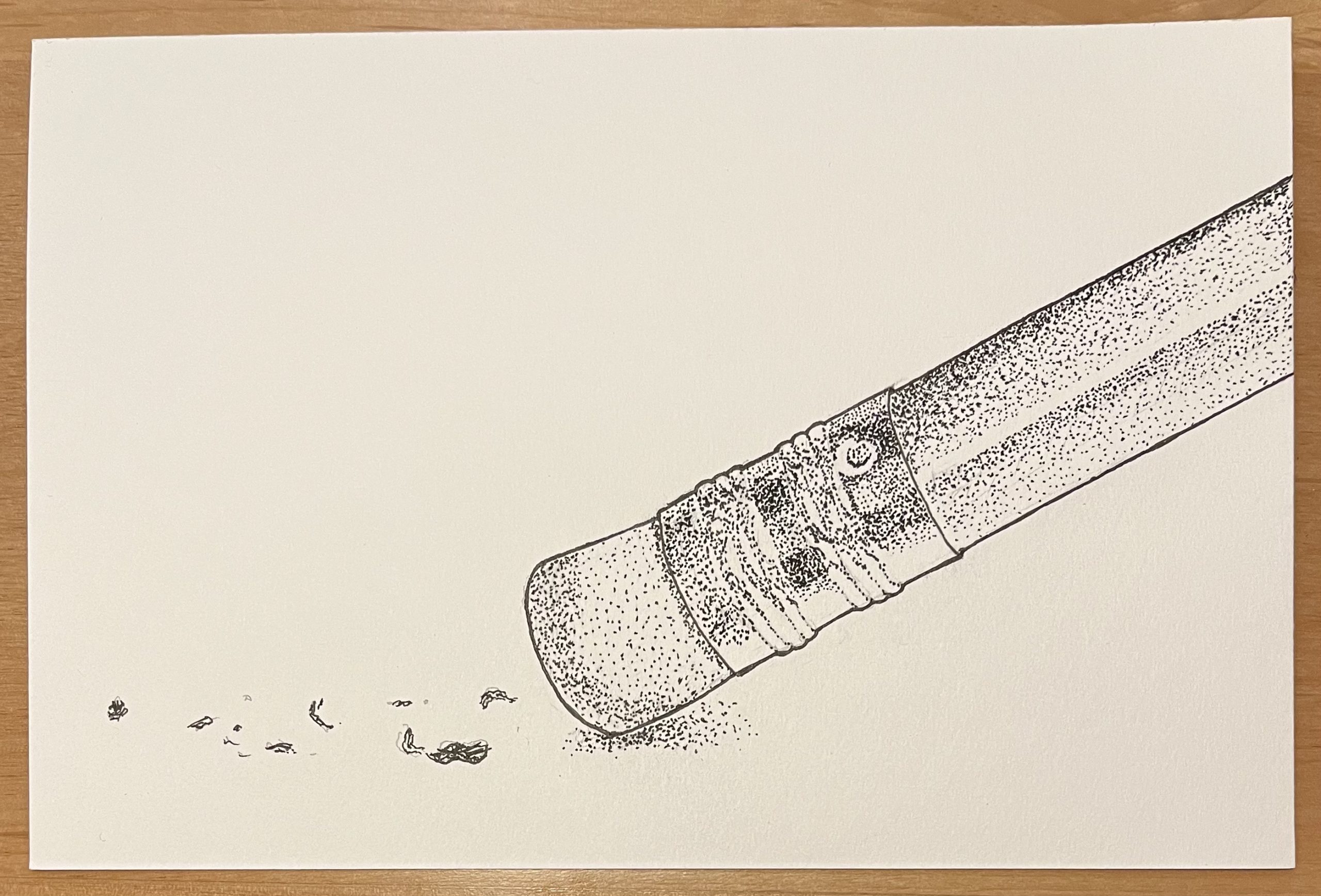
Today’s prompt was “remove”.
I am really digging this dot shading. I need to work on the range of dark to light, but I still think I’m doing a better job of shading with this than I ever have with cross-hatching.
Joumana Medlej specializes in art based on Kufic script, but also makes deeply layered objects (see the Treasure Boxes) and publishes historical and instructional books. She makes her own inks, and one of her books provides guidance for doing that yourself.
My visual language is rooted in the artistic culture of my native Middle East: I shape the ancient Kufic script to create images made of meaning. Free from iconography, but not obviously legible, the work bypasses the mind to engage a deeper recognition. The geometric compositions refer us not to the world of forms but to a cosmic order; their architectural quality generates a space in which one is held in contemplation and stillness.
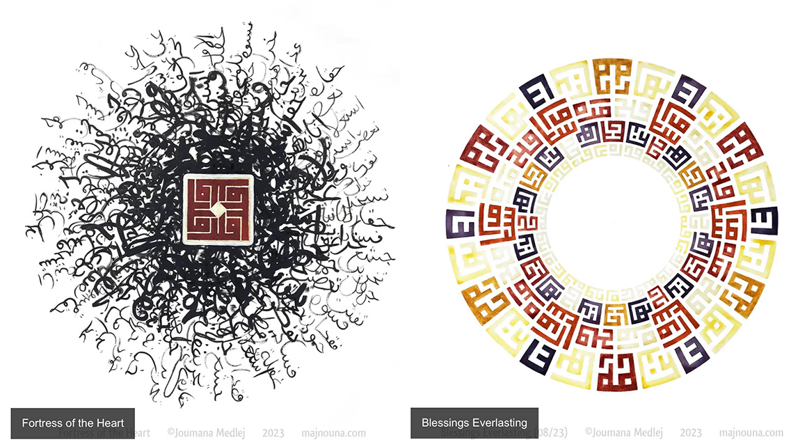
It’s all just amazing work.
David Shrigley: Artist pulps 6,000 copies of The Da Vinci Code and turns them into 1984
Shrigley spent what he describes as “a six-figure sum” publishing his edition of 1984s. This is his justification for each book going on sale at £495, a price as eye-opening as a rat in Room 101, to use 1984 parlance.
A portion of the profits will be donated to Oxfam, who have also been paid for the hire of the venue and will receive the proceeds of specially designed tote bags merchandise.“Four hundred and ninety five pounds seems like a kind of crazy price,” admits Shrigley, “However I have made an artwork, a signed print to go in it, which is based on a lot of the themes of 1984. So people are perhaps willing to pay that price for an original artwork of mine, where they might not be for the book, so I’ve sort of hedged my bets.”
Shrigley says it wasn’t about literary criticism, and I believe him, but also The Da Vinci Code is possibly the worst book I have ever read all the way through.
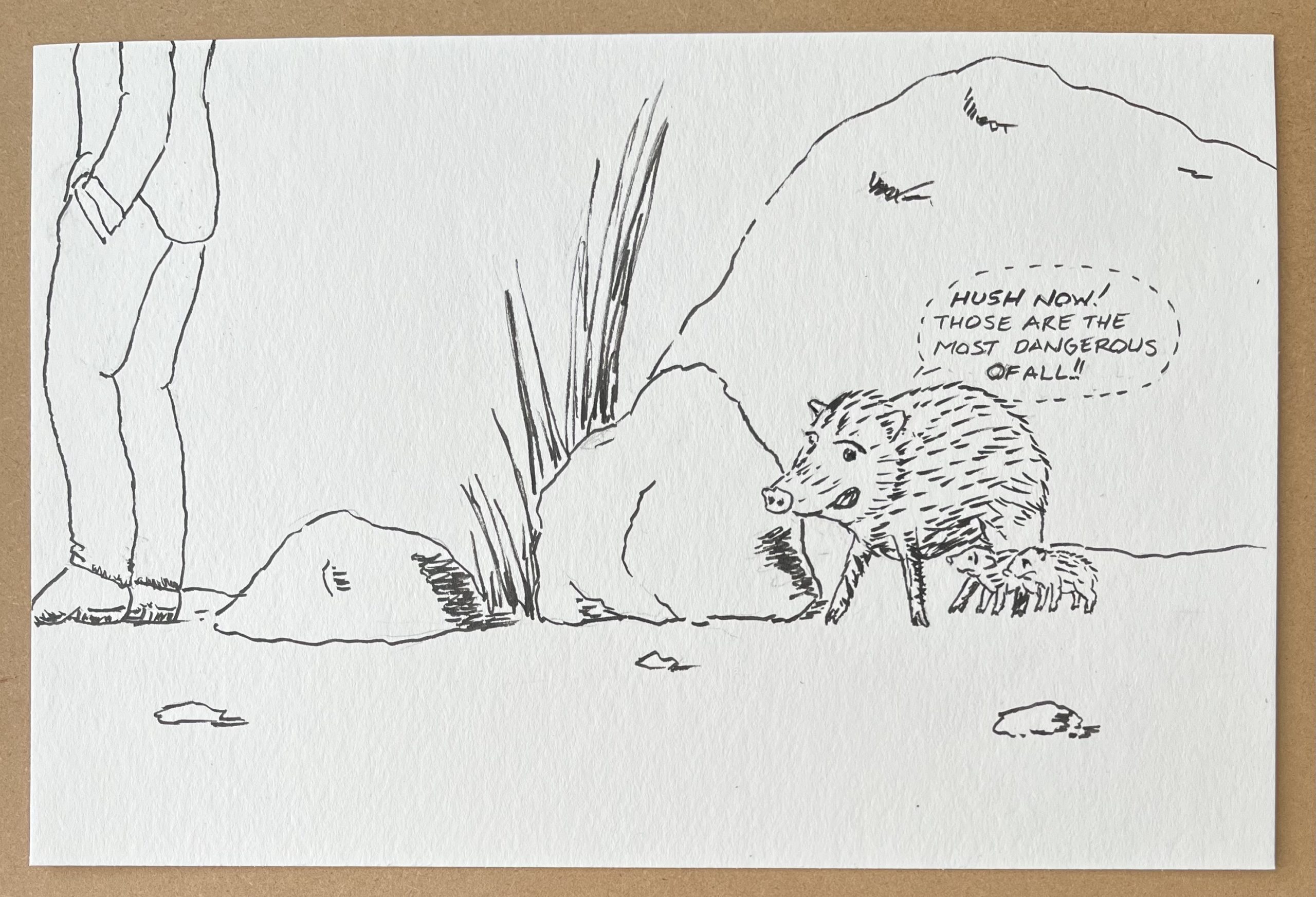
The daily prompt was “dangerous”.
There was a story on the radio today about a study done in South Africa that showed some animals are more afraid of human voices than of lions. Then I saw a photo of some javelinas and here we are.